Responsive
Website
Development
From desktops to mobile devices, we tailor website designs for peak performance and visual appeal, making sure your brand captures attention.

About WebSoftPlus
Why We’re Essential
Through personalization, we provide more than a website — we give you the tools to succeed.
Strengthen your online presence, improve SEO, and enjoy a smooth, stress-free experience that ensures your site stands out.


Bang for Buck
Value Additions
-
01

Cost-Effective
-
02

Enhanced SEO
-
03

Easier Management
-
04

Custom & Flexible
Creating Engaging Experiences with Responsive Website Development Services
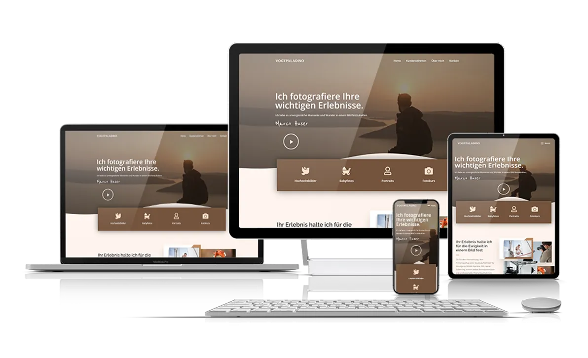
![WebSoftPlus]() Desktop Responsive
Desktop Responsive ![WebSoftPlus]() Laptop Responsive
Laptop Responsive ![WebSoftPlus]() Tablets/iPad
Tablets/iPad ![WebSoftPlus]() Smartphones
Smartphones
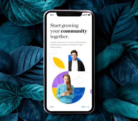
Desktop Responsive
A website that adjusts perfectly to all screen sizes isn’t optional — it’s essential!
As your responsive website developer, our team combines creativity, innovation, and technical skill to deliver precise, high-quality web experiences.
With smooth animations and intuitive navigation, we make your site truly memorable.
get started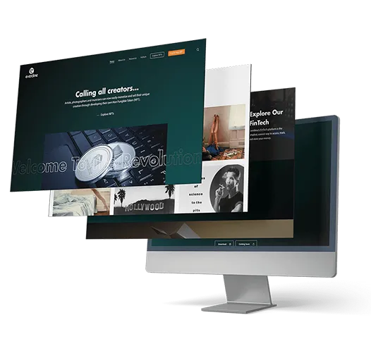
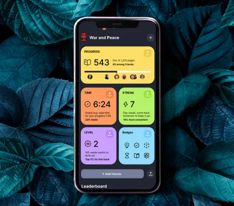
Laptop Responsive
As laptops are widely used, your website must adapt seamlessly to all sizes!
Fast-loading pages guarantee visitors enjoy smooth navigation without delays.
Our responsive sites let your brand impress users on every laptop, keeping viewers engaged everywhere.
get started
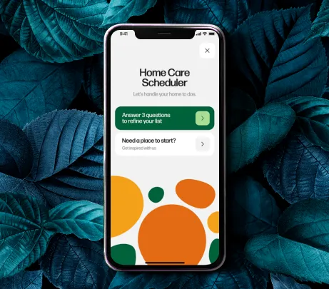
Tablets/iPad Responsive
Responsive design brings your website to tablets and iPads with unmatched convenience!
It puts your brand right at your users’ fingertips, delivering immersive experiences on every screen.
Engage and delight your audience with our expert tablet and iPad responsive web services.
get started
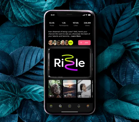
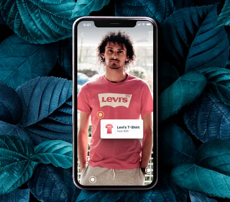
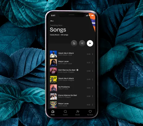
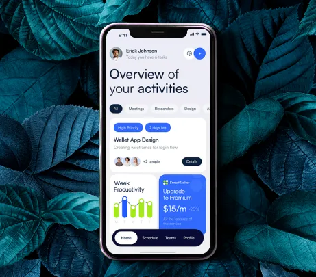
Smartphones Responsive
With smartphones central to daily life, having a mobile-ready site is essential.
Our websites connect your brand with users anytime, anywhere, capturing their attention with sleek, touch-friendly interfaces
We combine innovation and user-focused design for an exceptional mobile experience.
get started
WEBSITE DESIGN FACTS
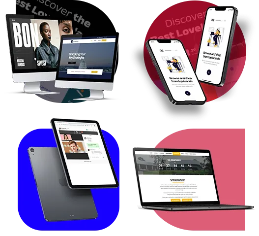
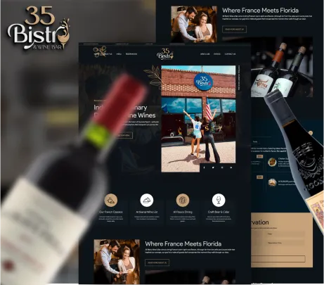
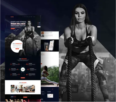
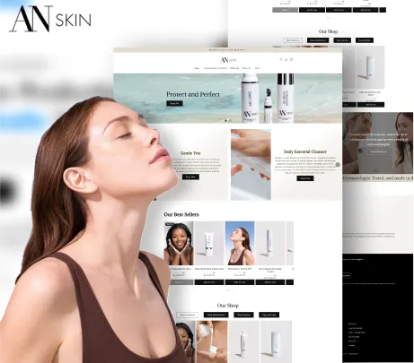
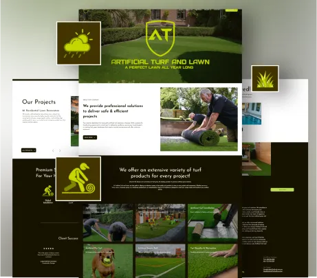
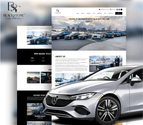
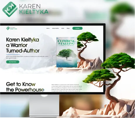
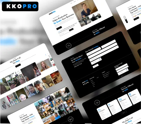
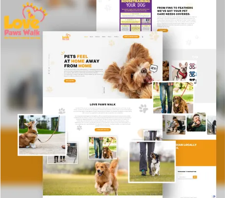
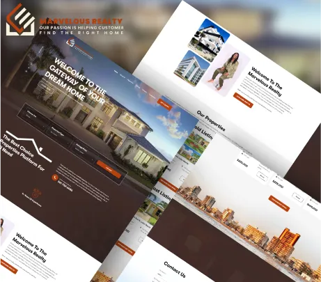
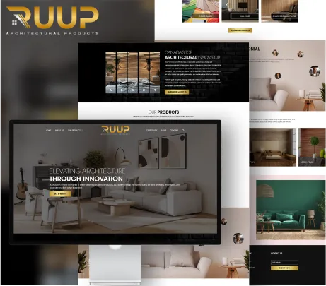
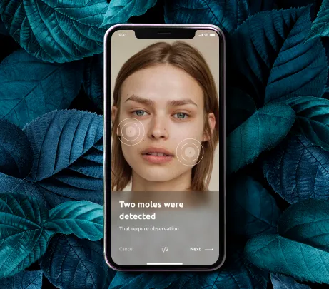
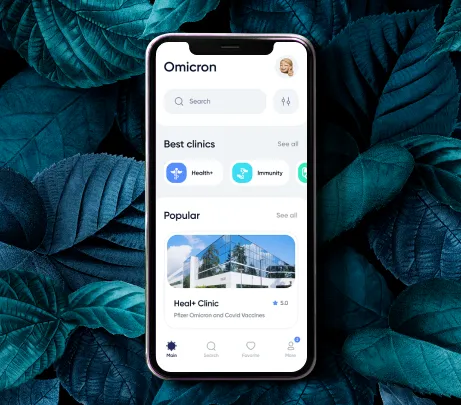
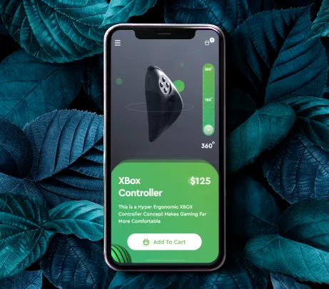
Showcasing Our Work
Over time,, WebSoftPlus has perfected the ability to deliver striking visuals, functional code,
and outstanding user experiences. Here’s a glimpse of our expertise.
- Website Development
- Application Development


Ready
To Migrate?
Hello, world! WebSoftPlus helps businesses set up websites and mobile apps designed to reach a global audience.
request a quote Let's Chat
Our Affordable Website & Application Pricing
- Website Development
- Application Development
- Digital Marketing
LIMITED TIME OFFER!
SIGN UP NOW & AVAIL SPECIAL DISCOUNT
Technologies We Work Upon
- App Development
- Hosting
- Web Development
- Web Maintenance
- Digital Marketing


Some of our clients from different industries!


This talented group of developers and designers managed to effortlessly translate our vision into an eye candy of a website.
We've lost count of how many compliments we've received from our clients for this design. I highly recommend WebSoftPlus!
Edgar Fox
President
WebSoftPlus is my go-to for mobile app development services. Their intuitive apps integrate seamlessly into our existing system, guaranteeing successful conversions.
Their team truly sets an example of professionalism and expertise when in conversation with clients.
Kristy Miller
Business Analyst
We fall short of words when discussing how pleased we are with WebSoftPlus responsive website services. We've finally switched from our outdated website to a sleek, modern, and responsive one!
It wouldn't have been possible without the team's commitment to professionalism and perfection.
Albert Stevenson
Chief Operating Officer
I'm delighted with the domain and hosting services provided by WebSoftPlus. They made every possible attempt to make the domain acquisition and host setup process hassle-free.
I highly recommend their services to businesses hoping to manage domain settings.
Alyssa Lynch
Product Manager

You Ask,
We Answer
Join hands with us as we set off on an exciting journey to create game-changing experiences for your business.

KNOW MORE ABOUT OUR SERVICES !
Responsive development is vital as users access websites on many types of devices. With mobile usage on the rise, a responsive site keeps content accessible and visually engaging for a wider audience.
It improves usability by offering smooth navigation, easy reading, and effective interactions across devices. Users don’t need to zoom or scroll excessively, making browsing more enjoyable and engaging.
Yes. Mobile-friendly websites are favored by search engines like Google, improving rankings—especially on mobile searches—and increasing visibility and organic traffic.
Yes. Existing websites can be made responsive through retrofitting. Experienced developers adjust the code and design so your site adapts smoothly to all screen sizes.
No. Responsive websites are optimized for speed and efficiency. With proper coding and image scaling, pages load quickly on every device, ensuring a smooth experience.

For more technical questions View More
Follow Our Socials
WebSoftPlus is available where you need it to be. Connect today!